The Baltic Dry Index (BDI) makes for an interesting, but imperfect, leading indicator for the movements of stock prices. I don’t know exactly why this works, and why it occasionally stops working, but the relationship has been going on for years and so, at some point, one just stops asking why.
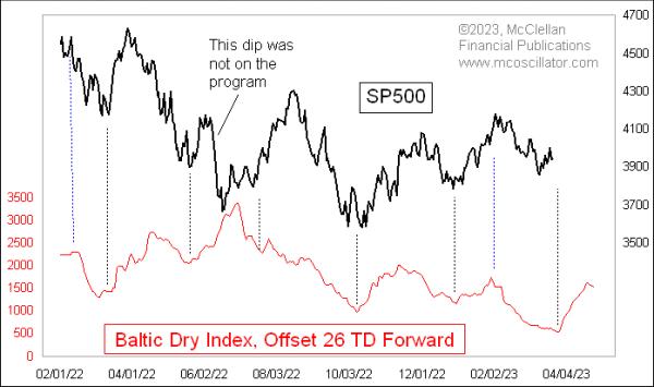
In this week’s chart, the plot of the BDI is shifted forward in the chart by 26 trading days. I have used 24TD before, and, at the moment, a 26TD lag time seems to be working better. I do this shift in the chart to make it easier to see how the BDI’s movements get repeated in the plot of the S&P 500.
The Baltic Dry Index is calculated and published by the Baltic Exchange, a maritime industry association and freight market information provider. The BDI is an average of the shipping rates charged for 3 different categories of dry bulk timecharter ships. The “dry” reference means it is talking about lease rates for cargo ships that haul materials like iron ore, as opposed to ships that haul containers, or oil tankers. Analysts view the BDI’s pricing information as an indication of economic strength, as companies are more or less willing to pay up for getting industrially-essential materials shipped.
How that translates into being an indication of what stock prices are going to do 26TD later is part of the fascinating mystery. But it has been working this way for years.
Right now, this model is saying that prices should resume their decline toward a low due at the end of March 2023, and then turn upward in April, at least for a while. The latest data for the BDI shows a tiny downturn, which may matter for stock prices, but not until after the 26TD lag time goes by.
Before you go out and plan your trading based on this chart, it is important to note that this relationship does not always work perfectly. Noted in that chart above is a significant adverse excursion off track in June 2022, when the S&P 500 fell hard, in disagreement with the BDI’s message. That was followed in July and August 2022 by the S&P 500 working extra hard to rally and try to get itself back on track.
There have been other instances in the history of this relationship where the stock market went off track in an even bigger way. Here is a longer-term look back:
The whole relationship went through a yearlong period of inversion back in 2019, which was coincidentally (or not?) right after the collapse of a retention pond at an iron mine in Brazil run by the company Vale, which sent a big disruption through the whole iron ore market. The leading indication relationship got back into sync again just in time for the COVID Crash bottom in March 2020, but it inverted again at the end of 2020. It worked well in 2021 and early 2022, and then we can see in this long-term chart that the weird stock market dip in June 2022 was another instance of an inversion to this relationship.
Any leading indication relationship that is fickle enough to invert in the past is suspect for perhaps doing so again in the future, and usually at the moment when one is counting on it most fervently to keep working.
So if you choose to believe in this relationship, which seems to be working really well right now, just keep in mind that it does not merit one’s complete trust.


